The long-term objective in this field is a virtual cell: a model of a cell accurate enough that questions put to it can be believed. Not a lookup table of experiments already performed, but a representation of how the system operates.
That objective is straightforward to state and difficult to test. The Virtual Cell Challenge, run annually by the Arc Institute, renders it measurable by perturbing the cell: one gene is switched off, and the model is assessed on whether it anticipated the response of the remainder. The framing paper describes this as a Turing test for the virtual cell, and the analogy holds. The perturbation is not the object of interest; it is the interrogation. A model that has captured how a cell is wired should be able to answer. A model that has memorised outcomes should not.
I have been working on the 2026 edition, and this post is my introduction to the problem: for readers who can program but have never handled a pipette, and for biologists who want to understand why this is a hard modelling problem rather than a data-cleaning exercise. I define every term at first use, every number and figure is measured from the challenge data itself, and I state plainly at the end the sense in which my own approach is not a cell model at all, which is precisely why it plateaus.
What is being modelled
The starting point tends to surprise readers arriving from software: every cell in the body contains the same genome. A liver cell and a neuron carry identical DNA. What differs is which genes each one is using.
A gene is a stretch of DNA that is copied into RNA, and that RNA is usually then translated into a protein that performs some function. Gene expression is the quantity of RNA a cell is currently producing from a given gene, which can be thought of as a volume control on that gene. The complete set of RNA in a cell is its transcriptome.
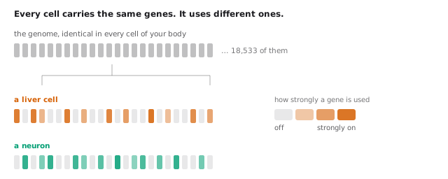 The same parts list, with a different subset switched on at different volumes. That pattern is the cell type, and it is what sequencing measures.
A cell type is therefore not a different parts list. It is a different configuration of the same parts list. The genome is the code; expression is the running process. The term “cell context”, used throughout this field, refers to exactly this: which genes are on, and how strongly.
Reading a cell one molecule at a time
Single-cell RNA sequencing measures that configuration one cell at a time. Thousands of individual cells are captured, each is tagged with a unique molecular barcode, everything is sequenced together, and the barcodes are then used to sort the reads back into per-cell profiles.
The result is a table.
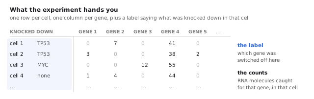 A knockdown does not change one number. It shifts the whole row slightly, which is visible only by comparing hundreds of cells that received it against hundreds that did not.
Rows are cells, columns are genes, and each entry counts how many RNA molecules of that gene were captured in that cell. Approximately 69% of that table is zero.
The following point is the one that most often misleads those modelling this data for the first time. A zero does not indicate that the gene is off. Sequencing captures only a sample of the molecules present, so a gene that is genuinely active can readily produce no reads at all in a given cell. This is termed dropout, although the zeros are consistent with ordinary molecule sampling rather than with some additional defect of the assay. It is not a rare edge case.
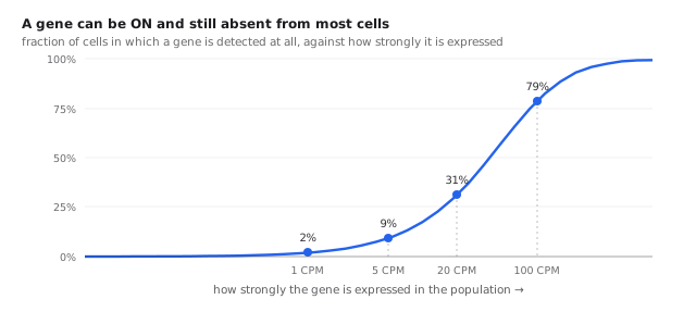 A zero in the matrix frequently means “missed” rather than “off”. This is why single cells must be pooled before any claim is made.
A gene expressed at 5 counts per million, which is a functioning level, is detected in under 10% of cells. Even at 20 CPM it appears in roughly a third. Only well above 100 CPM is it observed in the majority.
The consequence shapes everything downstream: little can be said about any individual cell. Statements become reliable only when hundreds of cells sharing a condition are pooled. This is why every method discussed here operates on populations, and why, as shown below, submitting a single best-guess cell profile is catastrophically wrong. The point is not merely conventional. Benchmarks of single-cell differential expression find that the methods which hold up against ground truth are precisely those that aggregate cells before testing.
Switching a gene off as a question
Establishing whether a system is understood requires perturbing it and checking whether the response was predicted. In a cell, the cleanest available perturbation is to switch off one gene and observe the remainder.
CRISPR is the tool. Its familiar form uses a protein called Cas9, guided to a chosen position in the genome by a short guide RNA, a piece of RNA whose sequence matches the target, where it cuts the DNA. The variant used here is CRISPRi, or CRISPR interference. It employs a Cas9 that has been deliberately disabled so that it can no longer cut. It parks on the gene’s control region and blocks the machinery that reads it, and fusing a repressor domain to that inactivated Cas9 makes the silencing strong and specific enough to operate at genome scale.
The gene is not destroyed but turned down, typically to 10 to 30% of normal. This is a knockdown rather than a knockout, and it is closer to real biology, where genes are usually modulated rather than deleted.
Combining the two ideas gives the following procedure. A different guide RNA is introduced into each cell in a large pool, so that every cell has a different gene knocked down, and all of them are then sequenced at once. Each cell reports both which gene was targeted in it and what happened to the other 18,000 genes. This is Perturb-seq, introduced by Dixit et al. and Adamson et al. in 2016, and a single experiment can survey hundreds of genes.
Two terms recur throughout. A perturbation is one gene knocked down, and a context is a particular kind of cell. The entire difficulty resides in the interaction between them: the same perturbation in a different context is a different experiment, and a model that has genuinely captured the cell should account for why.
What the challenge asks
The 2025 edition, the first, released approximately 300,000 H1 human embryonic stem cells carrying 300 genetic perturbations, divided into fine-tuning, validation and test segments. Over 5,000 people registered from 114 countries, more than 1,200 teams submitted, and over 300 made final submissions, competing for a $100,000 grand prize sponsored by NVIDIA, 10x Genomics and Ultima Genomics. The accompanying paper, “Virtual Cell Challenge: Toward a Turing test for the virtual cell”, appeared in Cell in 2025.
The structural detail that matters is this. In 2025 the target cell type was observed under perturbation. Participants had H1 stem cells with many perturbations measured and predicted different perturbations in that same cell type. A model could learn what responses look like in H1 specifically and fill in the gaps, which is interpolation.
The 2026 edition removes that.
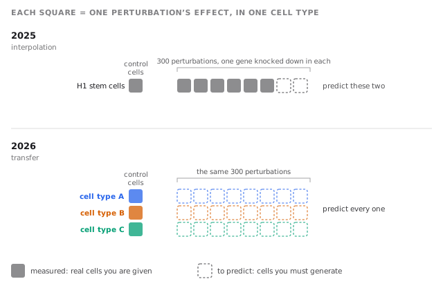 In 2025 the model observed one cell type responding and filled the gaps. In 2026 nothing about how the scored cell types respond can be learned before predicting them.
There is no training set. Knockdown responses must be predicted in cell types never observed under perturbation, given only those cells at rest and a list of genes to knock down. This is zero-shot prediction, and it demands something categorically different: whatever the model knows about perturbations must come from other cell types and still apply here.
This is the design decision that converts the competition into a test of modelling rather than of recall. A cell type that has been observed under perturbation can be handled well by remembering how it behaved. A cell type observed only at rest admits no such shortcut, and anything predicted must derive from having represented the cell itself, its state, and how that state shapes a response. That is the claim a virtual cell makes, and the 2026 design is built to check it.
The problem is genuinely open. Several 2025 benchmarking papers, most pointedly a Nature Methods study named scPerturBench, reported that large single-cell foundation models such as scGPT and Geneformer frequently fail to beat a trivial baseline predicting the same average response for every perturbation, and attributed this to inadequate representation of cellular context. A separate Nature Methods comparison reported the same result more bluntly: none of the five foundation models and two further deep-learning models it tested beat deliberately simple linear baselines. The field’s largest models are therefore not yet demonstrably modelling the cell either.
Examining the data before modelling anything
Three questions are worth answering before any model code is written.
How much signal is present in one cell?
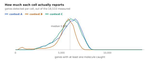 A typical cell reports about 5,900 of 18,533 genes, and nearly half the transcriptome is effectively silent in any one context.
A typical cell yields around 20,000 RNA molecules distributed across roughly 5,939 distinct genes out of 18,533. In addition, 47% of genes sit below 5 CPM in any given context, and 14% are not detected at all. This is not a defect but cell identity again. A skin cell does not run the neuronal program.
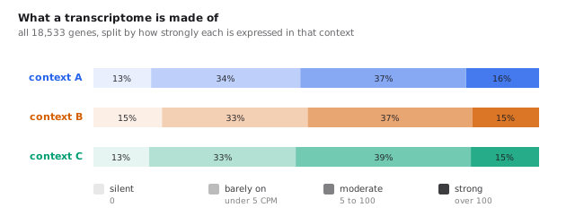 Half of every transcriptome is silent or barely on, and a gene that is off cannot be knocked down any further.
The consequence for the task is blunt: a gene that is already off cannot be knocked down any further. It can still be induced, and later sections return to what that costs, but a downward prediction for a silent gene has nowhere to go, and an upward one has to be read off a baseline near zero, which is exactly where the measurement is least reliable.
Are the three test contexts actually different?
Viewing 18,000 dimensions at once requires projection. PCA, or principal component analysis, identifies the directions along which the cells differ most and plots the first two. It is a rigid rotation of the data, so the distances displayed are real distances. This is worth stating, because the other embedding common in this field, UMAP, preserves neighbourhood structure but not distance.
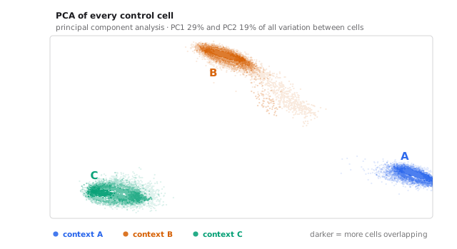 PCA is a rigid rotation, so these distances are real. A cell’s control profile alone is sufficient to identify which context it came from.
Every one of the 55,200 control cells is plotted. Three tight, well-separated clouds result, so the control cells alone identify their context before any perturbation.
This matters more than it initially appears. The control cells are the only description of the target cell that is provided, and they are evidently a rich one, since they identify the context unambiguously. Everything a model could know about these cells is contained in them. The question the challenge poses is whether that description can be converted into a prediction of how the cell will respond, which is the virtual-cell claim in miniature.
How do the contexts differ, gene by gene?
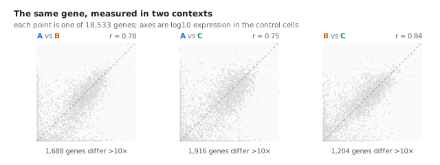 Aggregate distributions match almost exactly; individual genes do not. That gap is what makes a context a context.
The aggregate expression distributions of the three contexts are nearly superimposable; plotted as histograms they would be taken for replicates. Gene by gene they correlate at 0.75 to 0.84, and each pair contains over a thousand genes differing more than tenfold. Some are fully on in one context and silent in another.
That gap is what makes a context a context. It is also precisely what a model has to get right.
Identifying contexts A, B and C
The challenge does not disclose them. The three contexts arrive as anonymous populations of cells, which is reasonable, since the task is to predict rather than to look the answer up. The control profiles are nonetheless informative enough to separate the contexts cleanly, which raises the question of whether they are informative enough to name them.
One point should be stated first. These are the validation cell lines, used for the public leaderboard. The final entry is scored on three different held-out lines whose control profiles are released later. The official rules set out that split, and they also permit published experimental data as training material while forbidding its use as an answer, which is what makes the analysis below admissible rather than an exploit. What follows is therefore an analysis of the practice problem, not a route to the examination.
The data. DepMap publishes bulk RNA-seq for over 1,600 human cancer cell lines and is the standard reference atlas for questions of this kind. The profiles used here come from the 24Q4 public release. Each context supplies tens of thousands of unperturbed cells, which sum into a pseudobulk profile that is comparable in kind.
The method, with two adjustments that matter more than the correlation itself.
Single-cell pseudobulk and bulk RNA-seq have different capture biases, so the absolute similarity between them is not meaningful and only the ranking of candidates can be used. Furthermore, every human cell runs the same ribosomal and metabolic machinery, so a raw correlation is high for every pair and carries no information. The discriminating signal resides in genes that vary between cell lines, so the comparison uses the 3,000 most variable genes in the reference, with each profile centred on the reference mean before correlating. What remains is the component of a profile that makes a cell line that particular cell line.
Here is the context’s profile over the variable genes, is reference line , and is the mean across all reference lines. Subtracting from both sides removes the shared housekeeping signal, and the candidates are then ranked by .
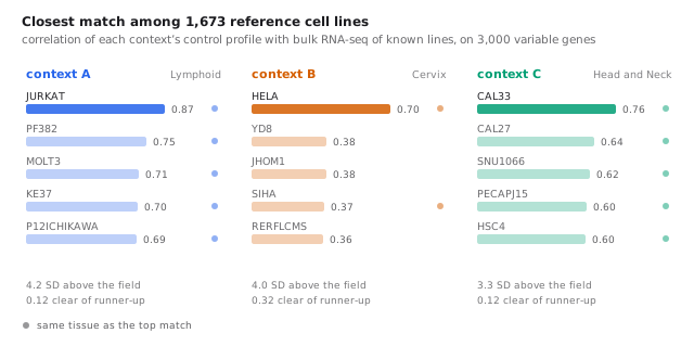 The top hit is suggestive; the fact that its neighbours share its tissue is what makes it convincing.
The results are unambiguous.
Context A matches Jurkat, an immortalised T-lymphocyte line, at 0.87, which is 0.12 clear of the runner-up and more than four standard deviations above the field. Context B matches HeLa, the most widely used cell line in biology, by the widest margin of the three, at 0.70 against 0.38 for anything else. Context C matches CAL33, a head-and-neck squamous carcinoma line, at 0.76.
The single best hit is suggestive; the company it keeps is what makes the identification convincing. Every one of A’s top five is a lymphoid line. Every one of C’s top five is head-and-neck. B’s runner-up field is more mixed, but its winning margin is more than twice that of any other context. The evidence is not that one line correlates slightly better, but that an entire neighbourhood of the atlas is the correct tissue and one line within it stands apart.
Why this is informative rather than merely satisfying. It establishes what kind of transfer problem each context represents. The public perturbation screens I use as training data, introduced in the next section, cover three activation states of CD4 T cells. Those are a different cell type from Jurkat, but the same lineage, meaning they descend from the same broad developmental family, in this case the lymphoid one. Nothing in the pool comes from cervix or head-and-neck tissue. Context A is therefore the only one of the three with even a lineage match available, and a later section shows how sharply agreement between two screens falls once the cell type changes at all. Any honest reading of an overall score has to account for two of the three contexts having no lineage-matched screen in the pool.
It also demonstrates how much a control profile discloses. A model that uses those cells only as a substrate to multiply against, as the one described below does, is leaving identifiable and structured information unused.
Transferring effects from other cell types
With no perturbation data available in the target contexts, the only option is to transfer measurements made elsewhere. Public Perturb-seq datasets exist for several human cell lines, so the effect of each knockdown can be measured in those lines and carried across.
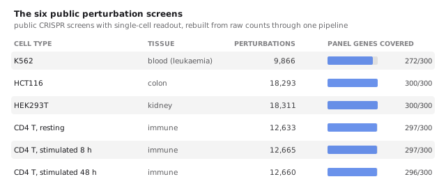 Coverage is not the constraint: 269 of the 300 panel genes were perturbed in all six screens.
I use six screens, spanning blood, colon, kidney and immune cells, the last of these in three activation states, which turns out to matter. They are the genome-scale K562 screen of Replogle et al., the HCT116 and HEK293T screens of X-Atlas/Orion, and the resting and stimulated CD4 T-cell screens of Zhu et al.. I rebuilt every one from raw counts through a single pipeline rather than taking the authors’ published fold changes. This sounds fussy and is not: different papers use different normalisations, pseudocounts and definitions of control, so mixing published effect sizes silently mixes estimators, and every downstream comparison inherits the resulting confusion.
Coverage is not the bottleneck. 269 of the 300 panel genes were perturbed in all six screens.
The quantity carried over is the log fold change: for each knockdown, how much each gene moved relative to untouched control cells, on a log scale so that a doubling and a halving are equal and opposite.
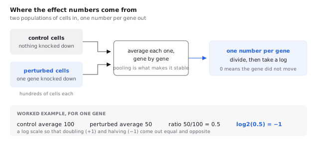 Repeating this for all 18,533 genes gives one row, and for all 300 perturbations gives the whole table. That table is the entire model.
Here is the average of gene across cells in which was knocked down, is the same quantity in untouched cells, and is a small constant preventing a gene absent from one side from sending the ratio to infinity. Base 2 means that is a doubling and a halving.
Stacking those numbers into a table with one row per perturbation and one column per gene gives what is referred to below as the effect table.
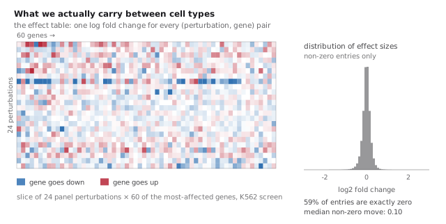 Most of the table is zero or near-zero; the signal is a thin scatter of genes that genuinely move.
Two features stand out. 59% of its entries are exactly zero, and that is a decision rather than an observation. I set to zero every gene whose expression in that screen’s control cells falls below 5 counts per million. A silent gene can of course be induced by a perturbation, and some are, but a fold change computed against a near-zero denominator is dominated by sampling noise, and the challenge’s differential-expression components discard genes below that level in any case, so an effect predicted there cannot score. The cost of the gate is that genuine inductions of silent genes are discarded along with the noise. The median non-zero change is 0.10 on a log2 scale, which is approximately a 7% shift. The heatmap displays the resulting texture: mostly near-nothing, with occasional rows where a perturbation moves many genes at once, and a thin scatter of real effects elsewhere.
That table is the object the method is betting on, which raises the question of whether it survives a change of cell type.
The measurement that makes this hard
That question can be answered directly. Take two screens, identify the perturbations both measured, and compute how similar their effect vectors are.
It is worth being honest about what this looks like on the page. Neither scatter below shows an obvious diagonal, because a cosine of 0.33 between two noisy 18,000-dimensional vectors is a shallow tilt buried in a dense cloud. The signal becomes visible only when the cloud is summarised: taking the median effect in the second screen within bins of the first traces a line that climbs steadily on the left panel and wanders around zero on the right. The same contrast appears in a simpler statistic. Within one cell type, 58% of genes move in the same direction in both screens; across cell types, 47% do, which is chance.
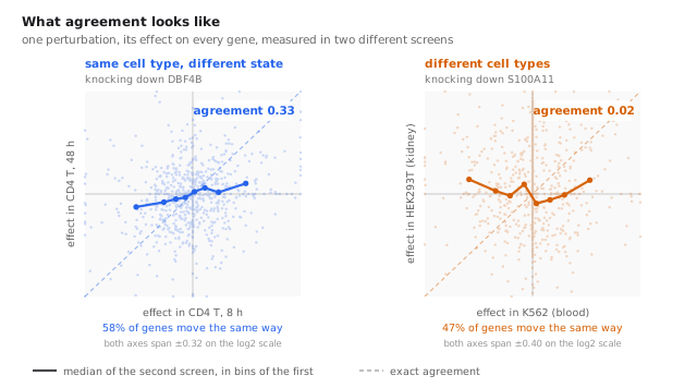 Both clouds look alike, which is the point: at this level of agreement the signal is not visible in the scatter and has to be drawn out. The trend line is what separates them.
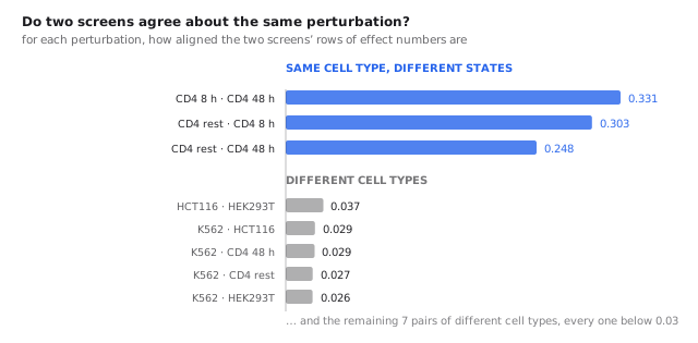 A tenfold drop the moment cell types are crossed. This single number is the whole difficulty of the task.
The same cell type in different states, meaning CD4 T cells resting against stimulated for 8 or 48 hours, gives agreement of 0.25 to 0.33. This is not high, but it is clearly real.
Different cell types give agreement of 0.016 to 0.037, for every such pair without exception. That is a tenfold collapse as soon as the cell type changes.
This single measurement is the whole difficulty of the challenge. Knocking out a gene in a blood cell and in a kidney cell produces effects that are, in direction, almost unrelated. The shared, generic component of a stress response transfers adequately. The component specific to which gene was targeted barely transfers at all, and that specific component is exactly what the scoring rewards, since it is what distinguishes one perturbation from another.
It also explains the benchmark results. If the transferable signal is this thin, a large model has very little to be large about.
Constructing the prediction, and what it sidesteps
Given the effect table, one decision remains, and it is the most consequential in the pipeline.
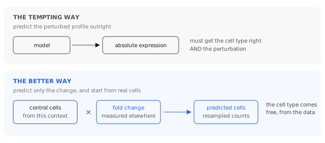 Which genes are on, at what level, and how much cells vary: all of it arrives with the target’s own control cells.
The tempting approach is to have a model output the perturbed cell’s expression directly. The better approach, and the one I take, is to predict only the change and apply it to control cells drawn from the target context.
The reason is that those control cells already encode everything context-specific at no cost: which genes are on, at what level, and with how much cell-to-cell variation. None of it has to be modelled, and none of it can be got wrong. What remains is the narrower question of how much each gene moves.
It is worth being explicit about what this manoeuvre is. It is not a model of the cell. It is a means of not requiring one. The target cell’s state is not represented, learned or reasoned about. It is imported wholesale, by starting from the target’s own cells and only ever predicting a change on top of them. The change itself comes from measurements in other cell types, unmodified.
That is why it works well and quickly, and it is equally the ceiling built into it. Every context-specific property the prediction gets right, it gets right by copying rather than by understanding, and copying cannot indicate how this cell will respond differently from those copied from.
Assembled, the pipeline has two steps.
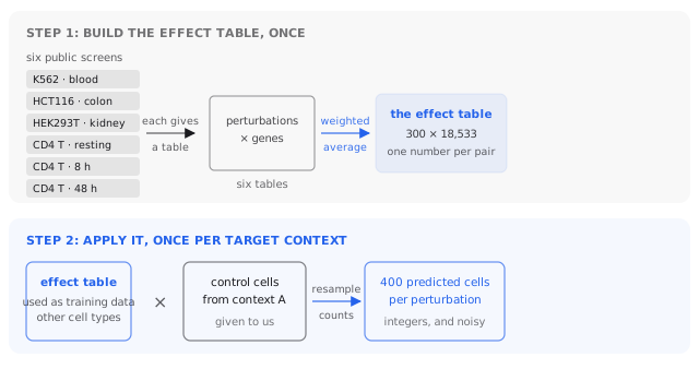 Step one never sees the target contexts. Step two runs once per context, and everything specific to that context arrives with its own cells.
Step one occurs once and knows nothing about the target contexts. Step two runs per context and is where the target’s own biology enters. The effect table is the model; everything else is bookkeeping.
Early attempts and what they establish
I want to be concrete about my early and unsuccessful versions, because each failure identifies something the working version depends on.
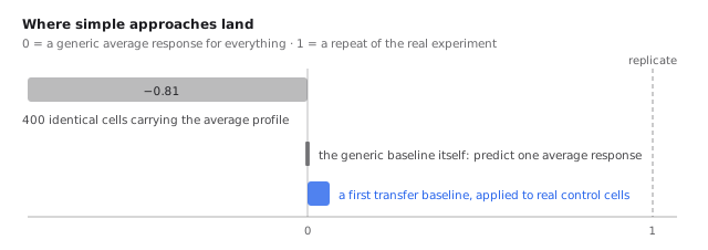 The naive submission is not merely weak. It is far worse than predicting nothing, because several scoring components run tests that require variation between cells.
Predicting one average response for everything. This is the scoring rule’s zero point and therefore scores 0 by construction. It is nonetheless a genuine strategy: if perturbation effects were mostly a shared stress response it would be difficult to beat, and it is the baseline the benchmark papers found foundation models struggling to exceed.
Predicting 400 identical cells carrying the correct average profile. This feels more accurate than the preceding idea and scores dramatically worse, at approximately −0.81, far below predicting nothing. Several scoring components run statistical tests for differential expression, comparing perturbed cells against controls, and those tests require cell-to-cell variation. Supplied with 400 copies of one profile, the variance is zero, the tests degenerate, and the components collapse. This is the dropout lesson from earlier arriving with a cost attached: the submission is a population, and its spread is part of the prediction.
Applying one other cell line’s measured effects. This clears zero modestly and was sufficient for rank 167. It is a weak model, but it establishes the property everything else depends on: perturbation effects do partially transfer.
Combining all six screens and taking care over how the simulated cells are generated moved it from rank 167 to 58, and then to 45. I stop short of the specifics of the better-performing versions, since the competition is still running and detailing them would not be in its spirit.
How submissions are scored
A submission consists of simulated cells: 400 for every (context, perturbation)
pair, amounting to 360,000 cells by 18,533 genes. Six components are computed and
averaged by the challenge’s
cell-eval scorer. They are worth
treating individually, because they do not measure the same thing and a change that
helps one routinely harms another.
The common scale. Every component begins as a raw quantity u, which is then
rescaled against a baseline b, the score of a generic average response, and an
anchor, the score of a perfect prediction. For components where lower is better
and perfect is zero:
and for those where higher is better and perfect is one, . A score of 0 therefore means no better than predicting one average response for everything, and 1 means as good as repeating the experiment, with the real cells split in half and one half scored against the other. That upper anchor is the honest one: reaching it means being as close to the truth as the biology is to itself.
Notation is fixed once. For perturbation , denotes the predicted change and the true one, both vectors over the 18,533 genes. The symbol denotes the baseline value of whichever raw quantity is under discussion.
1. Perturbation discrimination: was this perturbation predicted?
For each perturbation, the predicted change is compared against the true change of all 300 perturbations, and the rank of the correct one is recorded:
Here counts how many incorrect answers the prediction resembles more closely than the correct one, using cosine distance:
Ranking the correct answer first scores 1; landing in the middle scores 0.5, which is chance.
This is a retrieval metric rather than an accuracy metric. It does not ask whether the prediction is close to the truth, but whether it is closer to the correct truth than to the 299 incorrect ones. Because the distance is a cosine, it is entirely blind to magnitude: scaling every prediction by ten changes nothing.
2. Expression accuracy: is the predicted profile close?
This is squared error between predicted and true change, divided by the size of the true change, summed over perturbations. Unlike discrimination it registers magnitude: a prediction pointing in the correct direction but twice too far is penalised.
3. Fold-change accuracy: are the sizes correct?
This component is restricted to genes that genuinely changed in the real data:
with the log fold change and the set of genes that genuinely changed.
The name refers to magnitude, but the absolute difference makes this a direction metric as well, and sharply so. Taking one gene and reading off its contribution to the numerator, in units of :
| prediction | cost |
|---|---|
| correct, right size | |
| nothing () | |
| right size, wrong sign |
A sign error therefore costs exactly as much more than remaining silent as a correct call saves. Direction is first-order here rather than a secondary consideration: getting it backwards is worse than predicting no change at all.
The middle row is also the reason this component has a hard floor. Predicting nothing everywhere makes the numerator equal to the denominator, landing exactly on the reference point. Predicting zero is not free, since everything else is forfeited, but it is a floor this component alone cannot push a submission below.
4. Direction fidelity: the right genes, moving the right way?
Here k counts genes flagged as changed whose direction matches the reference,
n_pred is how many were flagged, and n_conf how many the reference is confident
about. The max in the denominator is the notable feature: flagging too few allows
n_conf to dominate, flagging too many allows n_pred to dominate. Both are
penalised, so the component cannot be gamed by calling everything or nothing.
5. Direction reach: how deep does the ranking stay correct?
Predicted changes are ranked by confidence and traversed, tracking the running
fraction whose direction is correct. Let k* be the deepest point at which that
fraction is still at least 0.9:
where is the fraction of the top- predicted genes whose direction is correct.
Fidelity asks whether the calls are correct. Reach asks how far down the ordering survives before it ceases to be correct, and therefore rewards a well-ordered prediction rather than merely an accurate one.
6. Significance overlap: were the same genes flagged?
Here R is the set of genes significantly changed in the real data and P the set
in the prediction, with the knocked-down gene itself excluded from both, since
reporting that the targeted gene went down is the premise of the experiment rather
than a prediction. This is a plain Jaccard index: of all genes flagged by either
side, what fraction was flagged by both.
What this means in practice
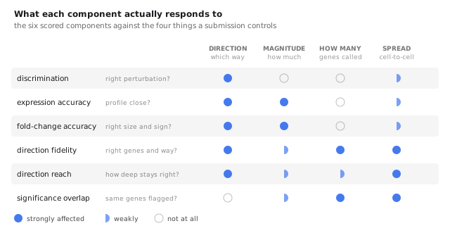 Discrimination is blind to magnitude. Fold-change accuracy responds strongly to both, since a sign error costs double what silence does. The three differential-expression components all require cell-to-cell spread.
Reading that grid explains why the task resists easy gains.
Discrimination cannot register magnitude at all, because a cosine is scale-invariant. Fold-change accuracy registers both strongly, direction through the doubled cost of a sign error and magnitude directly.
That combination makes the trade-off subtle rather than obvious. Direction and magnitude are not opposed within the metrics, and improving direction genuinely helps both components. The difficulty is that the operations available to me for sharpening direction, such as reweighting genes, recombining screens and decorrelating predictions, almost all disturb magnitude as a side effect, and fold-change accuracy charges for that immediately. Several quite different ideas of mine landed on nearly the same overall score for this reason: whatever direction they bought was returned through the magnitudes they disturbed. The useful question proved to be not which component I could push, but whether the underlying prediction was actually more accurate, since only that moves several components at once without incurring a cost.
The right-hand column explains the identical-cells result described earlier. The three differential-expression components all depend on statistical tests comparing predicted perturbed cells against controls, and those tests require cell-to-cell variation. Emitting 400 copies of one profile sets the variance to zero, the tests degenerate, and half the scoreboard collapses, which is how a submission can land far below predicting nothing.
Why the problem remains hard
Measurement noise is larger than intuition suggests. In a 2026 Perturb-seq dataset spanning 16 cell lines, each gene was targeted by two independent guide RNAs in the same line. Those are two measurements of the same biological quantity, and they agree only modestly, not far above the agreement between different cell lines. Since predictions are scored against one noisy measurement, some of the apparent error is irreducible, and some of what appears to be poor transfer is the noise floor of the assay showing through.
The deeper reason is the one from the preceding section, and the screen-agreement figure is where it becomes concrete. Effects transfer between cell types at a cosine of approximately 0.02. A method built on copying measured effects is therefore working through a channel that is almost closed, and no amount of care in how the copying is done will widen it, because the information is simply not present in the source.
What would widen it is a model that represents the target cell and derives the response from that representation, rather than importing a response measured elsewhere. That is the virtual-cell claim, and Arc’s own State model is an attempt at exactly it. This challenge is a fair test of that claim precisely because it withholds every opportunity to substitute recall for understanding.
Conclusion and future work
The 2026 challenge is a considerably cleaner test than the 2025 one. Withholding perturbation data entirely for the scored cell types stops rewarding models that memorise one cell type and forces the real question: has anything general been learned about how genes regulate one another?
My own results indicate that a careful and simple approach reaches surprisingly far, that my largest early gains came from respecting the structure of the data rather than from model capacity, and that the remaining gap is not obviously closed by building something larger. The tenfold drop in agreement once the cell type changes is, in my view, the single most important number for anyone beginning work on this problem.
Here is where I would take it next.
- Establish the noise floor before pursuing accuracy. If two guides against the same gene in the same cell line agree only moderately, the ceiling on any predictor is lower than the metric implies, and the appropriate target may be the reproducible component of the response rather than the measurement itself.
- Convert the control profile into a model rather than a starting point. The embeddings show that the control cells identify their context unambiguously, so the information is present. Using it only as a substrate to multiply against is the shortcut; learning how that state modulates a response is the actual problem, and the one worth failing at.
- Treat public perturbation data as one dataset rather than many. Rebuilding everything from raw counts through a single pipeline is unglamorous and repaid itself immediately.
- Design for the population rather than the average. The identical-cells failure is the clearest lesson of the exercise: the distribution emitted is part of the prediction, not a presentation detail.
References
Everything above that is not measured from the challenge data is drawn from these. Links in the body point into this list.
The challenge
- Roohani, Y.H. et al. Virtual Cell Challenge: toward a Turing test for the virtual cell. Cell 188, 3370–3374 (2025).
- Adduri, A. et al. Virtual Cell Challenge 2026: benchmarking zero-shot generalization across cellular contexts. Cell (2026).
- Arc Institute. Official rules and 2026 announcement.
- Arc Institute.
cell-eval. The scorer the six components come from. - Adduri, A.K. et al. Predicting cellular responses to perturbation across diverse contexts with State. Cell (2026).
Measuring cells, and switching genes off
- Qi, L.S. et al. Repurposing CRISPR as an RNA-guided platform for sequence-specific control of gene expression. Cell 152, 1173–1183 (2013).
- Gilbert, L.A. et al. Genome-scale CRISPR-mediated control of gene repression and activation. Cell 159, 647–661 (2014).
- Dixit, A. et al. Perturb-seq: dissecting molecular circuits with scalable single-cell RNA profiling of pooled genetic screens. Cell 167, 1853–1866 (2016).
- Adamson, B. et al. A multiplexed single-cell CRISPR screening platform enables systematic dissection of the unfolded protein response. Cell 167, 1867–1882 (2016).
- Svensson, V. Droplet scRNA-seq is not zero-inflated. Nature Biotechnology 38, 147–150 (2020).
- Squair, J.W. et al. Confronting false discoveries in single-cell differential expression. Nature Communications 12, 5692 (2021).
- McInnes, L., Healy, J. and Melville, J. UMAP: uniform manifold approximation and projection for dimension reduction. arXiv:1802.03426 (2018).
The public perturbation screens, and the noise floor
- Replogle, J.M. et al. Mapping information-rich genotype–phenotype landscapes with genome-scale Perturb-seq. Cell 185, 2559–2575 (2022). K562.
- Huang, A.C. et al. X-Atlas/Orion: genome-wide Perturb-seq datasets via a scalable fix-cryopreserve platform. bioRxiv (2025). HCT116 and HEK293T.
- Zhu, R. et al. Genome-scale perturb-seq in primary human CD4+ T cells maps context-specific regulators of T cell programs and human immune traits. Cell (2026). CD4 T cells, resting and stimulated.
- Ward, L. Dissecting context-dependent cancer vulnerabilities using Perturb-seq, data. figshare (2026). The 16-line, two-guide design behind the noise-floor estimate.
Identifying the contexts
- Ghandi, M. et al. Next-generation characterization of the Cancer Cell Line Encyclopedia. Nature 569, 503–508 (2019).
- DepMap, Broad. DepMap 24Q4 public. Figshare+ (2024).
OmicsExpressionProteinCodingGenesTPMLogp1, the reference matrix used here. - Cellosaurus: Jurkat, CVCL_0065 · HeLa, CVCL_0030 · CAL-33, CVCL_1108.
What the large models can and cannot do
- Wei, Z. et al. Benchmarking algorithms for generalizable single-cell perturbation response prediction. Nature Methods 23, 451–464 (2025). scPerturBench.
- Ahlmann-Eltze, C., Huber, W. and Anders, S. Deep-learning-based gene perturbation effect prediction does not yet outperform simple linear baselines. Nature Methods 22, 1657–1661 (2025).
- Cui, H. et al. scGPT: toward building a foundation model for single-cell multi-omics using generative AI. Nature Methods 21, 1470–1480 (2024).
- Theodoris, C.V. et al. Transfer learning enables predictions in network biology. Nature 618, 616–624 (2023). Geneformer.